Obama's Sun Dawns
 Barack Obama is in.
He announced this morning in the birthplace of Abraham Lincoln and in front of the state capital where he launched his political career only ten years ago. The frigid Midwestern temperatures meant that we couldn't really get a peek at Barack's sartorial style (and, in warmer weather, his apparently stunning physique). Barack made the unfortunate decision of announcing in a massive black overcoat, which his opponents - most notably Hillary - had avoided by launching their candidacies online and in the comfort of a warmly decorated room. The open-air ambience is a nice touch, but I would have gone with a heavier wool suit and a lot of space heaters instead of the overcoat and the scarf, which give the air of Barack as stopping through only briefly and not even having enough time to shed his outerwear and have a serious conversation about the country's future.
 There is one area of political style, however, in which Barack has clearly set himself apart: his logo is brilliant.
Eschewing the dead-horse stars-and-stripes theme that his co-candidates have all chosen, Barack decided to symbolize his candidacy with a circular logo that captures all of the elements of the flag. The red-and-white stripes recall the cornfields of the Midwest whence Barack comes and that hold the key to his electoral success. The blue is, obviously, translated into a bright and hopeful sky. In the background, a bright sun, with warming tones of yellow, rises over the land as what is unmistakably dawn; there is no debate this time - unlike when Benjamin Franklin was asked of his chair in Independence Hall - whether America is rising or declining. With Barack, America is rising to a new day.
The whole logo is encapsulated in a circle that resonates with the "O" that leads Barack's last name. There are no sharp edges and no sharp points. It is clean, clear, and wholesome. Kudos to whomever designed this little subtle but powerful thing. Absolutely brilliant.
By comparison, the losers in the category include:
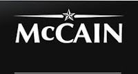
 What is this? The 1800s? Color made its debut 50 years ago. John McCain's campaign would do well to use it. And black... A funeral for America? Dour, depressing, and aged: that's what this logo tells me about John McCain and his candidacy.
 Sam's logo looks like a seventh-grader made it for a middle-school art project. Someone accidentally left on the caps lock button while typing "Brownback," perhaps under some delusion that making EVERY WORD BIG evokes power. Actually, it evokes tacky.
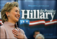
 Better. The streamer effect with the American flag is modern, and the waves look natural (unlike Brownback's American flag). The "Hillary" looks a tad muscular, which is probably what the first serious major-party woman candidate for president wants to project. I wonder, though, what those three stars stand for, since each star on the American flag symbolizes one of the fifty states. Someone needs to think through that symbolism.


1 Comments:
Those of us who were there won't fault Senator Obama for the overcoat. He doesn't need to show how tough he is by standing in those temperatures without the proper attire ... as anyone standing out in the Illinois cold would tell you today -- if anything he was underdressed.
I do agree that his logo is brilliant. Although I don't totally agree with your observations on the other logos.
Brownback's is hideous ... I agree there.
Hilary's is decent, though safe. I'm not sure, however, that the three stars have to "stand" for anything. While some logos, like Obama's, clearly include symbolism of that nature, some just don't. I think it's simply stars and strips - not a flad - and that's all it's meant to be. Do you have the same issue with candidates who use a single star? I simply think three is a number that works well, and I think in her case it works, too. Maybe it's for Hilary (1) Rodham (2) Clinton (3). Or maybe it's for I'm (1) Not (2) Bill (3)?
McCain's is simple but strong. I think it fits his personality well. The rising sun just wouldn't work for him. And be patient. I would assume once he formally announces the greyscale of his logo and website will borne out in full-color. A nice visual metaphor ... not too unlike the simple to subsantial that Obama's logo and website went through in the last 24 hours.
Post a Comment
Subscribe to Post Comments [Atom]
<< Home